Table of Contents
Some Rules for Making a Presentation
General thoughts
There are thousands of persons that compiled on thousands of websites their individual rules for improving presentations. Time for me to add my thoughts. Let me start with the most important rule: <font inherit/inherit;;inherit;;#FFFF00>You should only break the rules if you know them</font>.
The following websites are a good starting point. I visited those while I wrote my lines to crosscheck my compilation:
Second, <font inherit/inherit;;inherit;;#FFFF00>Content is King.</font> A quick google search for the statement Content is King pointed me to Bill Gates article from 1996 in which he expressed that “…anyone with a PC (…) can publish whatever content (…)”. The problem here is obvious: it is the arbitrariness that comes along with a PC and software like Powerpoint that enables everyone to present Whatever. To make it short: I expect from a presentation that there is something worth to be presented.
Let us assume that you have worked on a specific theme. Let us also assume that you have gained knowledge that is interesting enough to be shared with a more or less interested audience. A presentation is the tool to support you to get the spark over to your audience. Edward R. Tufte outlined in his essay The Cognitive Style of Powerpoint: Pitching Out Corrupts Within (Graphics Press, Cheshire, 2006) that “Powerpoint compared to other common presentation tools, reduces the analytical quality of serious presentations of evidence”. Do you want to diminish your valuable work through presenting it in a bad/wrong/ugly way? If not, keep on reading.
I am a big fan of good delivered presentations. There is not much better then to follow a great story with the support of <font inherit/inherit;;inherit;;#FFFF00>slides as a visual and explanatory backdrop</font>. On the other hand there are not many things that I would consider worse then being forced to watch terribly boring and horribly made powerpoint presentations. I share the following thoughts to hopefully assist you to create better presentations: better structured, better presented, and better looking. Your audience (and I) will be thankful! — Felix Beck 2017/02/17 16:19
Designing a presentation
- Reduce the amount of slides (my thumb-rule: 1 slide per 1 minute. If you have a 20 minutes presentation slot you should not have more then 20 slides incl title and imprint.)
- Structure your presentation (Introduction, Mainpart, Conclusion)
- Less is more (use an unobtrusive template design, see below).
- No visual twaddle: Practice design – not decoration.
- If you show a picture, show it big.
- Show infographics that are understandable and contain actual information.
- Never stretch a font. It is all about readability – Typography rules!
- Never use more than two typefaces.
- Reduce bullet-point lists where possible.
- Do not use acronyms.
- Remember Conway’s Law…
- Use visual effects or transitions between slides only if really necessary – and if so, use it only ONCE.
Giving the presentation
- Know your software
- Know your hardware
- Use slides as visual backdrop
- Name your colleagues and other sources
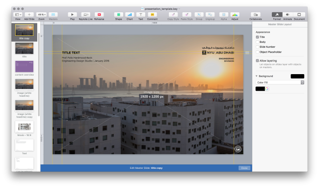
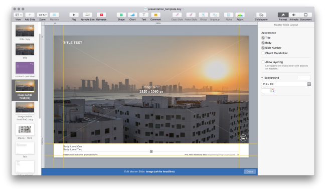
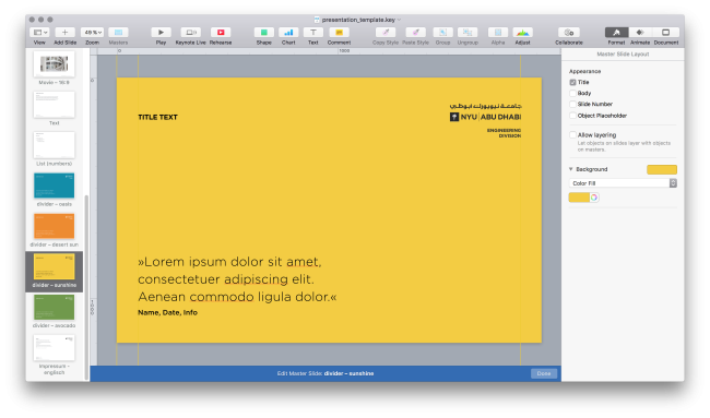
Using the NYUAD Engineering Template for Keynote
There is a Google Slides template that got horrificly used by a student and no longer serves as an example, and there is a new template — Felix Beck 2020/01/07 04:48.


